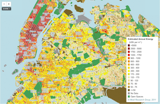
A colossal posterchild for urbanity, the luminescent New York skyline has always been the focus of marvel and awe. But now researchers have mapped its environmental impact in a new study by Columbia Engineering.
In the interactive map, users can zoom down to astoundingly intricate detail to view annual energy consumption data for individual buildings across the five boroughs – that’s over one million, in case you were wondering – derived from statistical data and broken down into specific energy uses like electricity and space heating. “New York state uses more energy than all of sub-Saharan Africa,” Vijay Modi told Washington Post Journal Metropolis. That’s one big slice of the global energy pie.
Visually simple yet staggeringly complex, the map is designed not only for researchers and policymakers to better strategize the city’s energy policy and infrastructure development, but also for New York residents to think about – and re-think – their own consumption. “We want to start the conversation for the average New Yorker about energy efficiency and conservation by placing their energy consumption in the context of other New Yorkers,” the study’s lead author, Bianca, Howard, said in a statement. “Just knowing about your own consumption can change your entire perspective.”
The success of this model in mapping such a dense urban area demonstrates the potential of energy mapping in helping reshape energy and infrastructure systems – on a local, regional or even a global scale. It provide a comprehensive statistical framework like never before for countries wanting to make large-scale energy cuts and for the Average Joe – it takes peering over your neighbor’s fence to a whole new level.
Check out the map here and the full study here.